'There is a game I play' - Analyzing Metacritic scores for video games
There is a game I play / try to make myself okay / try so hard to make the pieces all fit / smash it apart / just for the f**k of it (Nine Inch Nails: The Big Come Down)
After this rather distressing opening by the Nine Inch Nails, let’s turn to a more uplifting topic: video games! There is a dataset on Kaggle with ratings for over 4000 video games. Let’s see what we can do with that, shall we?
Preparations
First, I’ll load the file. I like fread() from {datatable} because it does most of the boring work for you like checking the separator - and it’s really fast. It creates a data.table, of course, and for this post, I don’t want that. So, I’m converting it ‘back’ to a data.frame.
library(data.table)
games <- as.data.frame(fread("metacritic_games.csv"))
This is how the first six rows of this dataset look like. There are more columns, so feel free to scroll to the left.
scroll_box(kable_styling(kable(head(games))),
width = "100%", height = "500px")| game | platform | developer | genre | number_players | rating | release_date | positive_critics | neutral_critics | negative_critics | positive_users | neutral_users | negative_users | metascore | user_score |
|---|---|---|---|---|---|---|---|---|---|---|---|---|---|---|
| Portal 2 | PC | Valve Software | Action | E10+ | Apr 18, 2011 | 51 | 1 | 0 | 1700 | 107 | 19 | 95 | 90 | |
| The Elder Scrolls V: Skyrim | PC | Bethesda Game Studios | Role-Playing | No Online Multiplayer | M | Nov 10, 2011 | 32 | 0 | 0 | 1616 | 322 | 451 | 94 | 82 |
| The Legend of Zelda: Ocarina of Time 3D | 3DS | GREZZO | Miscellaneous | No Online Multiplayer | E10+ | Jun 19, 2011 | 84 | 1 | 0 | 283 | 20 | 5 | 94 | 90 |
| Batman: Arkham City | PC | Rocksteady Studios | Action Adventure | T | Nov 21, 2011 | 27 | 0 | 0 | 240 | 34 | 27 | 91 | 87 | |
| Super Mario 3D Land | 3DS | Nintendo | Action | No Online Multiplayer | E | Nov 13, 2011 | 81 | 1 | 0 | 251 | 39 | 11 | 90 | 84 |
| Deus Ex: Human Revolution | PC | Nixxes Software | Action | No Online Multiplayer | M | Aug 23, 2011 | 52 | 0 | 0 | 520 | 112 | 78 | 90 | 85 |
You don’t see this in the first six lines, but some games appear several times in the list for releases on several platforms. For now, I am aggregating these different releases to get only one (mean) value for each game. The resulting data.table has over 1k fewer rows than the original one.
games.agg <- aggregate(cbind(metascore, user_score) ~ game, FUN = mean, data = games)
nrow(games)
## [1] 5699nrow(games.agg)## [1] 4018Comparing metascores and user ratings
Metacritic has - of course - metascores, but it also has user ratings. Both of these are available in our dataset. So, let’s start by comparing those two. I suspect them to be highly correlated, but maybe there are also some interesting differences. I will start by drawing a simple scatterplot with a center diagonal. If a data point lies on the dashed red line, the metascore is the same as the user score. We will see, that this is not the case for all of the points.
library(ggplot2)
ggplot(games.agg, aes(x = metascore, y = user_score)) +
  geom_point(alpha = .3, pch = 15) +
  geom_density_2d() +
  geom_segment(data = data.frame(),
               inherit.aes = F,
               aes(x = 0, y = 0, xend = 100, yend = 100),
               lty = "dashed", col = "red") +
  scale_y_continuous(limits = c(0, 100)) +
  scale_x_continuous(limits = c(0, 100)) +
  labs(x = "Metascore", y = "User score", fill = "Count")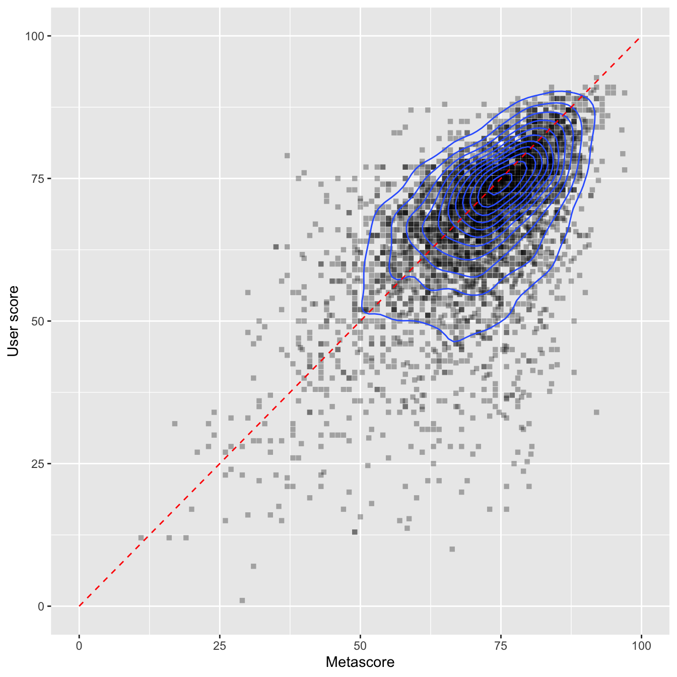
The ‘contour lines’ (created by geom_density_2d()) show us where the majority of the data points lie. There is a strong concentration at around 75/75. But we also see that there are some major disagreements between metascores and user scores. I will investigate them a bit further. If we say that there is a “disagreement” between metascores and user scores, we can try to capture this in a statistical way by calculating the residuals of a linear regression (a prediction) from metascores on user scores. The residuals are prediction errors, i.e. everything in a game’s user score that cannot be explained by the game’s metascore.
I will calculate the linear regression model lm(). Then, I extract the residuals and save them in the variable res.user.score. Using these, I am extracting the 10 highest negative residuals (user score is much lower than metascore) and the 5 highest positive residuals (user score is much higher than metascore). I am then creating a column Label which holds the game’s name if the game has one of these highest or lowest residuals. The rest is some ggplot() trickery. Drop me a comment if you want to know more about specific things. The blue line represents the regression line - the visualization of the regression model.
library(ggrepel)
lmod <- lm(user_score ~ metascore, data = games.agg)

games.agg$res.user.score <- residuals(lmod)

lowest.res <- games.agg$game[order(games.agg$res.user.score)][1:10]
highest.res <- games.agg$game[order(games.agg$res.user.score,
                                    decreasing = T)][1:5]

games.agg$Label <- ifelse(games.agg$game %in% c(lowest.res, highest.res),
                          games.agg$game, NA)

ggplot(games.agg, aes(x = metascore, y = user_score)) +
  geom_point(pch = 15, aes(color = is.na(Label), alpha = is.na(Label))) +
  scale_color_manual(values = c("TRUE" = "black", "FALSE" = "red")) +
  scale_alpha_manual(values = c("TRUE" = .3, "FALSE" = 1)) +
  geom_smooth(method = "lm", formula = "y ~ x", se =  F) +
  scale_y_continuous(limits = c(0, 100)) +
  scale_x_continuous(limits = c(0, 100)) +
  geom_text_repel(aes(label = Label), force = 3, size = 3) +
  guides(col = F, alpha = F) +
  labs(x = "Metascore", y = "User score", fill = "Count")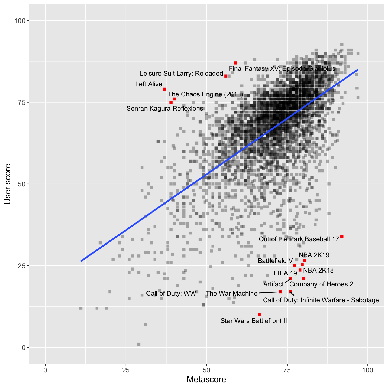
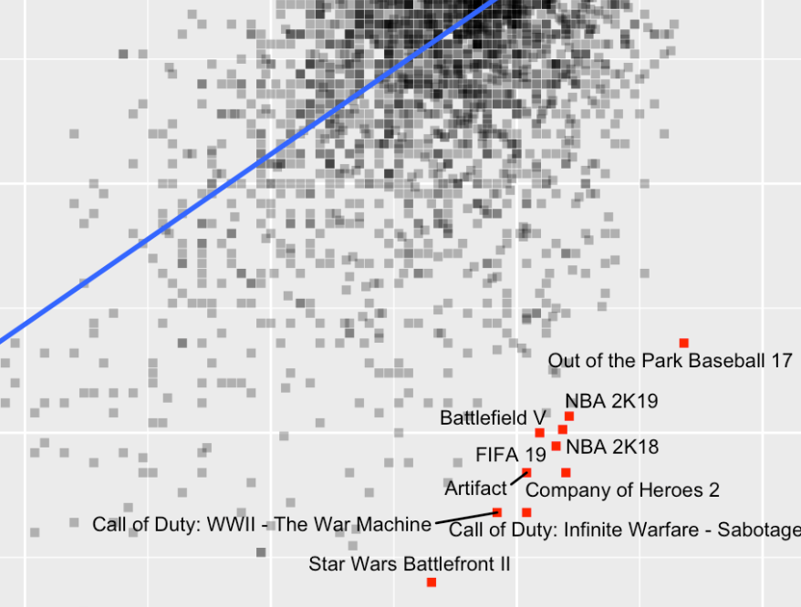
Ouch, EA Sports - some of your recent games don’t seem to meet your customers’ standards. If I am not completely mistaken, ‘NBA 2K19’ and ‘NBA 2K18’ (what’s even the point of this ‘K’? You don’t even save a single character by using it… get your shit together, EA Sports!) as well as ‘FIFA 19’ are (were?) all bloated with lootbox mechanics. This kind of gambling mechanics in a video game doesn’t seem to go well with the audience - although most of the critics don’t seem to care.
The labelled games above the regression line are the five games with the highest positive residuals. As I wrote above, these are the games where the customers gave very high scores in comparison to the critics. I have to say that I don’t know any one of these games…
Comparing the busiest developers
Now, I am going to compare the developers that are represented by the most games in the dataset. For this, I am first creating a sorted table of games per developer and am subsetting games to only extract the games from these developers. Then, we have to aggregate again to yield one datapoint per game, even if it was published on several platforms.
I am sorting the developers’ factor levels by the mean metascore (that sorts the boxplots in decreasing order), and in the end, I am assigning the worst 7 games a label to make them show up in the plot later.
dev.tab <- sort(table(games$developer), decreasing = T)
games.dev <- games[games$developer %in% names(dev.tab[1:10]),]


games.dev.agg <- aggregate(cbind(metascore, user_score) ~ game + developer,
                           FUN = mean, data = games.dev)

games.dev.agg$developer <-
  factor(games.dev.agg$developer,
         levels = names(sort(tapply(games.dev.agg$metascore,
                                    games.dev.agg$developer,
                                    mean), decreasing = T)))

games.dev.agg <- games.dev.agg[order(games.dev.agg$metascore),]
games.dev.agg[1:7, "Label"] <- games.dev.agg[1:7, "game"]
There is a design principle in data visualizations that, whenever possible, you should show all datapoints. To do so, I am overlaying the boxplots with a beeswarm plot created by the {ggbeeswarm} package. Furthermore, I am adding a red circle for the mean value of each developer.
library(ggbeeswarm)
ggplot(games.dev.agg, aes(x = developer, y = metascore)) +
  geom_boxplot(outlier.shape = NA) +
  geom_beeswarm(alpha = .5, pch = 15, col = "blue") +
  geom_point(stat = "summary", size = 4, col = "red", alpha = .5) +
  geom_text_repel(aes(label = Label), size = 3) +
  labs(x = "", y = "Metascore") +
  theme(axis.text.x = element_text(angle = 45,
                                   hjust = 1,
                                   size = 12))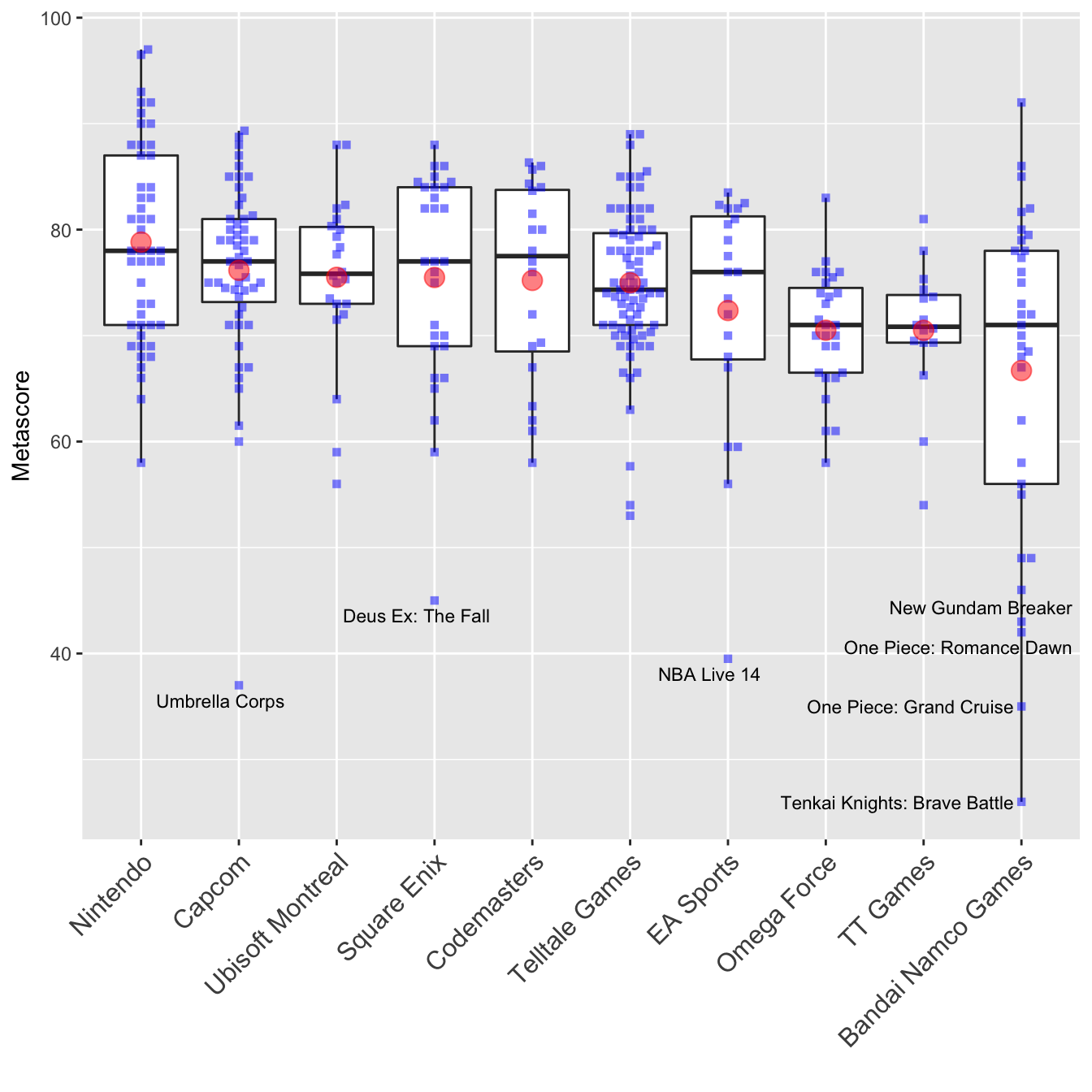
Remember that we are only seeing metascores here. Nintendo seems to make really good games. There are no outliers on their track record and they have the highest average metascore. Capcom is quite interesting - although they’re the second best developer, there is one game (‘Umbrella Corps’) that is a huge outlier. Let’s do exactly the same with user scores.
games.dev.agg$developer <-
  factor(games.dev.agg$developer,
         levels = names(sort(tapply(games.dev.agg$user_score,
                                    games.dev.agg$developer,
                                    mean), decreasing = T)))

games.dev.agg <- games.dev.agg[order(games.dev.agg$user_score),]
games.dev.agg$Label <- NA
games.dev.agg[1:7, "Label"] <- games.dev.agg[1:7, "game"]
ggplot(games.dev.agg, aes(x = developer, y = user_score)) +
  geom_boxplot(outlier.shape = NA) +
  geom_beeswarm(alpha = .5, pch = 15, col = "blue") +
  geom_point(stat = "summary", size = 4, col = "red", alpha = .5) +
  geom_text_repel(aes(label = Label), size = 3) +
  labs(x = "", y = "User score") +
  theme(axis.text.x = element_text(angle = 45,
                                   hjust = 1,
                                   size = 12))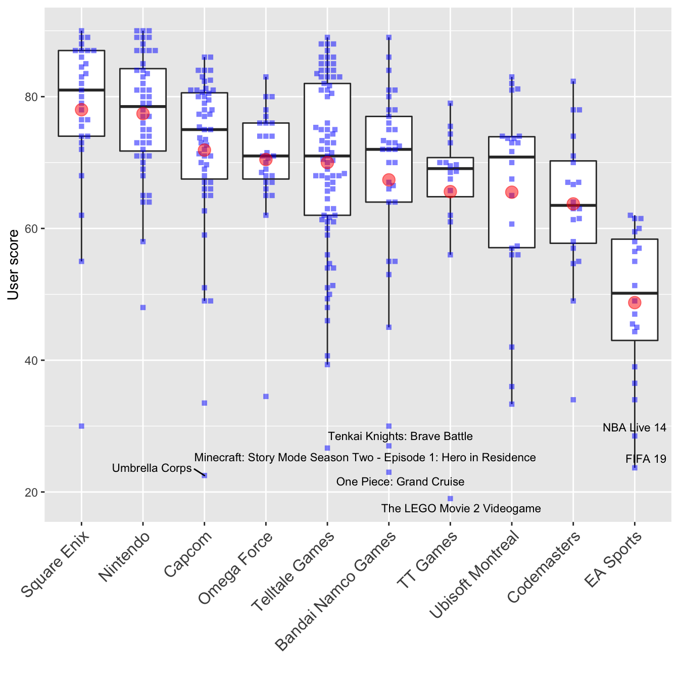
My gosh, users really hate ‘FIFA 19’, don’t they? I don’t know why, but ‘The LEGO Movie 2 Videogame’ is the worst user-rated game in this subset - and it’s a huge outlier compared to the rest of TT Games’ games. And as we can see: users agree with the critics concerning ‘Umbrella Corps’.
Ratings through time
Are video games getting worse or better over time? And do critics and users agree? Let’s find out. Here, I am doing a simple linear regression from date on time. This might not be the best choice because time series data might need other statistical methods, but for now, let’s play around with “normal” regression a bit. First, we have to define the release_date column as date variable. The mdy() function from the {lubridate} package does an excellent job here.
library(lubridate)
games$release <- as.Date(mdy(games$release_date))
Outliers can be a problem during regression analysis, so I want to get rid of them. Here, I am using the simple boxplot heuristic with a range of 1.5 times the interquartile range. Everything below or above is treated as an outlier and will not be used in the linear model.
is.outlier <- function (x) {
  x < quantile(x, .25) - 1.5 * IQR(x) |
    x > quantile(x, .75) + 1.5 * IQR(x)
}

games$is.out.meta <- is.outlier(games$metascore)
games$is.out.user <- is.outlier(games$user_score)

meta.mod <- lm(metascore ~ release, data = games, subset = !is.out.meta)
user.mod <- lm(user_score ~ release, data = games, subset = !is.out.meta)
summary(meta.mod)
##
## Call:
## lm(formula = metascore ~ release, data = games, subset = !is.out.meta)
##
## Residuals:
## Min 1Q Median 3Q Max
## -28.6996 -6.0113 0.9763 7.1450 24.6318
##
## Coefficients:
## Estimate Std. Error t value Pr(>|t|)
## (Intercept) 5.573e+01 2.863e+00 19.467 < 2e-16 ***
## release 1.015e-03 1.701e-04 5.964 2.61e-09 ***
## ---
## Signif. codes: 0 '***' 0.001 '**' 0.01 '*' 0.05 '.' 0.1 ' ' 1
##
## Residual standard error: 9.677 on 5549 degrees of freedom
## Multiple R-squared: 0.00637, Adjusted R-squared: 0.006191
## F-statistic: 35.57 on 1 and 5549 DF, p-value: 2.611e-09summary(user.mod)##
## Call:
## lm(formula = user_score ~ release, data = games, subset = !is.out.meta)
##
## Residuals:
## Min 1Q Median 3Q Max
## -57.965 -6.152 2.577 8.594 25.826
##
## Coefficients:
## Estimate Std. Error t value Pr(>|t|)
## (Intercept) 90.1050410 3.7616060 23.95 < 2e-16 ***
## release -0.0013233 0.0002235 -5.92 3.42e-09 ***
## ---
## Signif. codes: 0 '***' 0.001 '**' 0.01 '*' 0.05 '.' 0.1 ' ' 1
##
## Residual standard error: 12.71 on 5549 degrees of freedom
## Multiple R-squared: 0.006276, Adjusted R-squared: 0.006097
## F-statistic: 35.04 on 1 and 5549 DF, p-value: 3.416e-09The summaries of the two models show us that there are, indeed, significant effects of release on the scores. More interestingly, the effects point in opposite directions: metascores increase through time while user scores decrease through time (as indicated by the signs of the estimates). However, we also have to check the size of the effect. And, well, it’s not very big. Indeed, it’s tiny. Also, the variance explained in scores by release date (as indicated by the R-squared values) is only around 0.6 percent. So, let’s not overestimate these effects. The following regression plots also suggest that there seem to be a lot more things going on there - the regression lines are almost horizontal. There are a lot more things one can do to evaluate regression models - but let’s move on.
ggplot(games[!games$is.out.meta,], aes(x = release, y = metascore)) +
  geom_point(alpha = .3, pch = 15) +
  geom_smooth(se = F, method = "lm") +
  labs(subtitle = paste0("beta = ", signif(meta.mod$coefficients["release"], 3),
                         ", Outliers removed (Boxplot with r = 1.5)"),
       x = "Release date", y = "Metascore", title = "Release date vs. Metascore")
## `geom_smooth()` using formula 'y ~ x'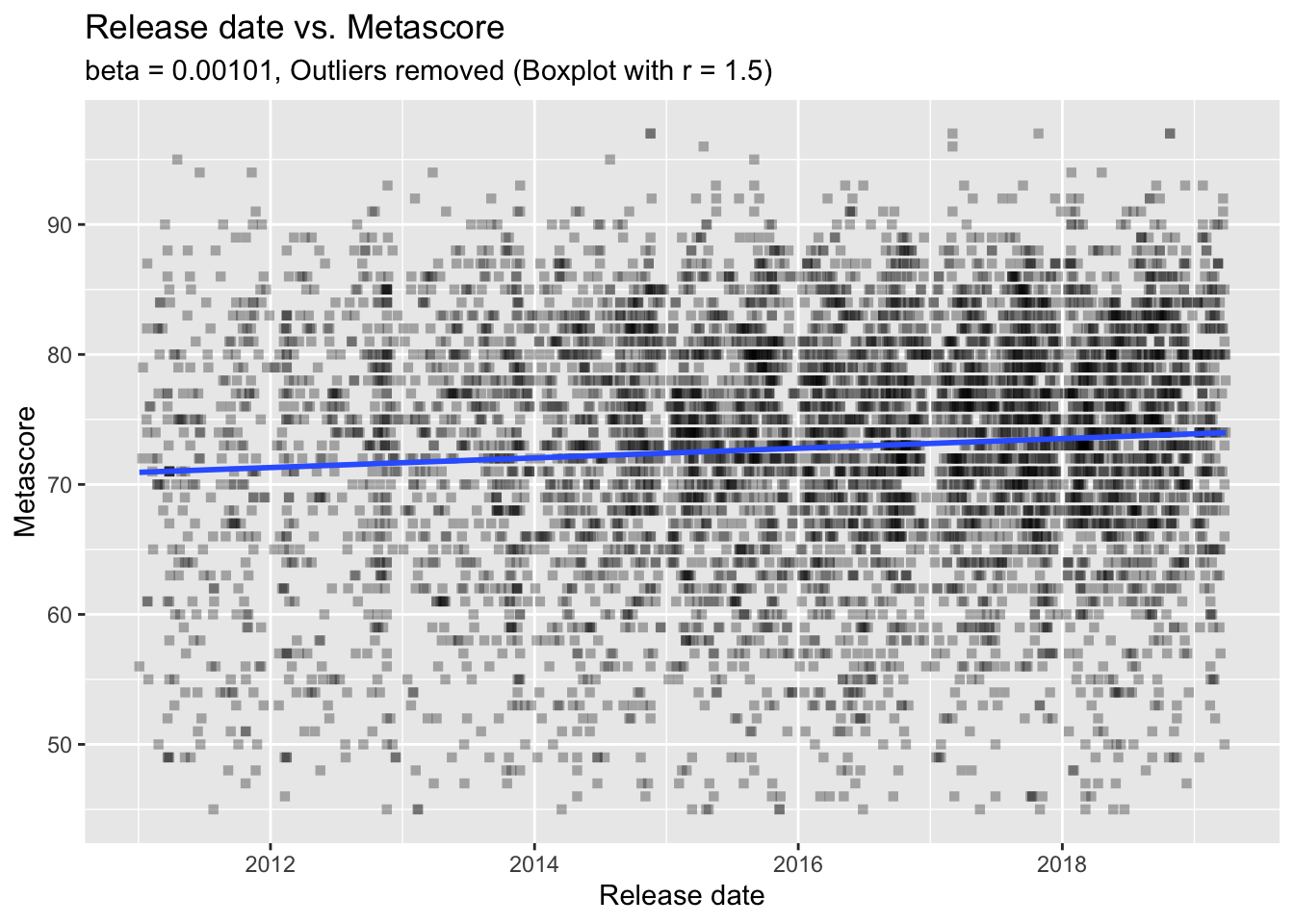
ggplot(games[!games$is.out.user,], aes(x = release, y = user_score)) +
  geom_point(alpha = .3, pch = 15) +
  geom_smooth(se = F, method = "lm") +
  labs(subtitle = paste0("beta = ", signif(user.mod$coefficients["release"], 3),
                         ", Outliers removed (Boxplot with r = 1.5)"),
       x = "Release date", y = "Metascore", title = "Release date vs. User score")
## `geom_smooth()` using formula 'y ~ x'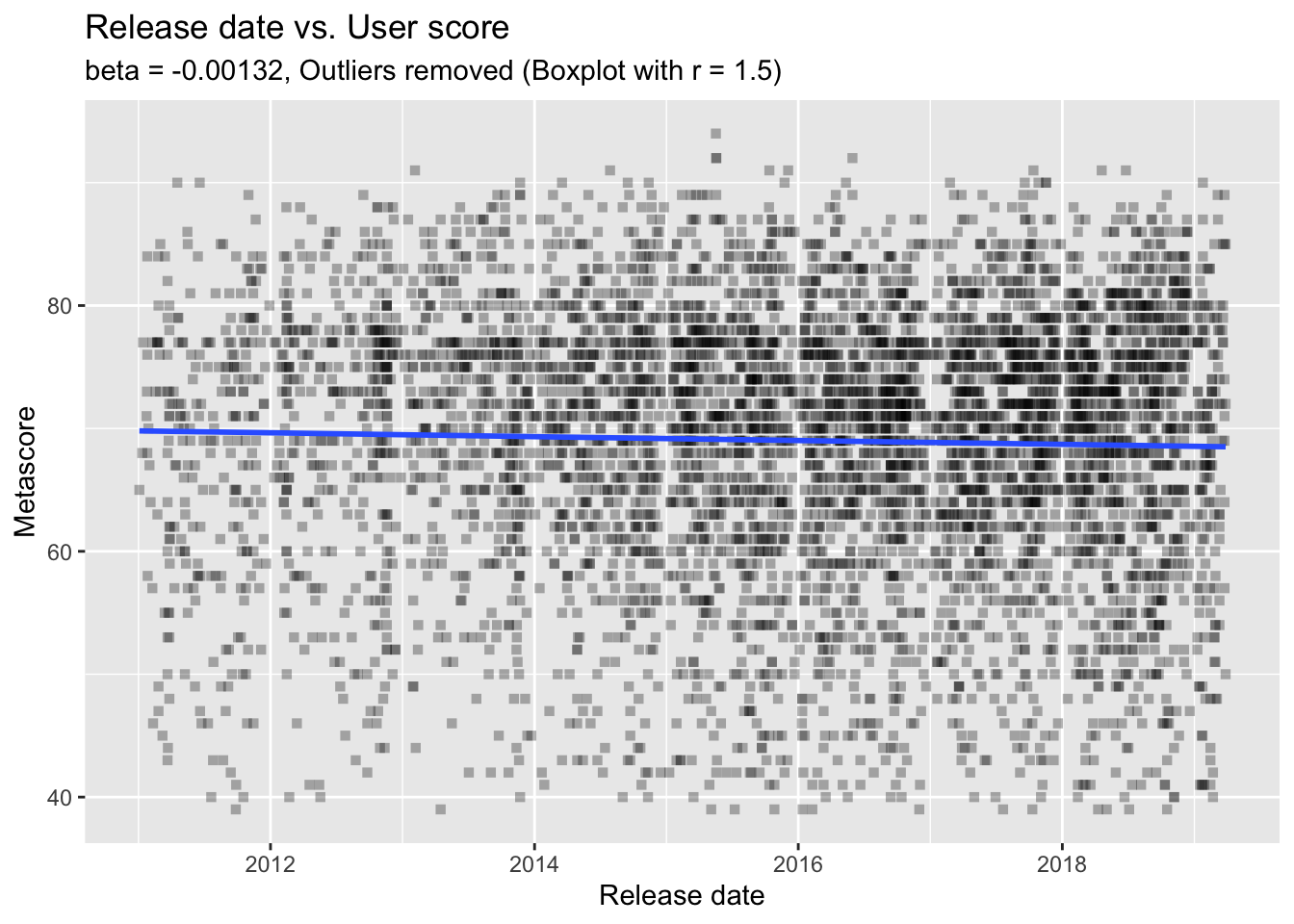
ESRB ratings by genre
For our last analysis, I want to see if certain genres are associated with certain ESRB ratings. To do so, I am selecting the genres with the most games (and ‘shooter’ because it should be the genre most closely associated with the ‘Mature’ rating). I am then recoding the ratings to make them more readable.
library(car)
sub.games <- unique(games[games$rating %in% c("E", "E10+", "M", "T") &
                            games$genre %in% c("Action", "Action Adventure",
                                               "Role-Playing", "Adventure",
                                               "Strategy", "Sports",
                                               "Simulation", "Racing",
                                               "Puzzle", "Shooter"),
                          c("rating", "genre", "game")])

sub.games$rating <- recode(sub.games$rating, "'E'='Everyone'; 'E10+'='Everyone 10+'; 'T'='Teen'; 'M'='Mature'")

sub.games.tab <- table(sub.games$rating, sub.games$genre)
scroll_box(kable_styling(kable(sub.games.tab)), width = "100%")| Action | Action Adventure | Adventure | Puzzle | Racing | Role-Playing | Shooter | Simulation | Sports | Strategy | |
|---|---|---|---|---|---|---|---|---|---|---|
| Everyone | 215 | 28 | 20 | 48 | 53 | 19 | 0 | 35 | 89 | 18 |
| Everyone 10+ | 274 | 81 | 26 | 13 | 13 | 64 | 2 | 11 | 15 | 48 |
| Mature | 253 | 205 | 76 | 2 | 1 | 100 | 10 | 8 | 2 | 27 |
| Teen | 371 | 93 | 70 | 9 | 8 | 176 | 4 | 38 | 20 | 107 |
So, that is our contingency table. To see if there are any clear associations between genres and ESRB ratings, we have to deal with the marginal probabilities of ESRB ratings (how often specific ratings are given overall) and genres (how many games there are in the dataset for a specific genre). We could do a Chi-Squared test and visualize this with a mosaicplot. Here, I want to do something different - a correspondence analysis. I introduced the {ca} package with a different dataset in my previous post. All of the code I am now using is explained there.
library(ca)
ca.fit <- ca(sub.games.tab) # do the ca
ca.sum <- summary(ca.fit)   # needed later for dimension percentages
ca.plot.obj <- plot(ca.fit)
make.ca.plot.df <- function (ca.plot.obj,
row.lab = "Rows",
col.lab = "Columns") {
df <- data.frame(Label = c(rownames(ca.plot.obj$rows),
rownames(ca.plot.obj$cols)),
Dim1 = c(ca.plot.obj$rows[,1], ca.plot.obj$cols[,1]),
Dim2 = c(ca.plot.obj$rows[,2], ca.plot.obj$cols[,2]),
Variable = c(rep(row.lab, nrow(ca.plot.obj$rows)),
rep(col.lab, nrow(ca.plot.obj$cols))))
rownames(df) <- 1:nrow(df)
df
}
# Create plotting data.frame for ggplot
ca.plot.df <- make.ca.plot.df(ca.plot.obj,
row.lab = "Rating",
col.lab = "Genre")
# Extract percentage of variance explained for dims
dim.var.percs <- ca.sum$scree[,"values2"]library(ggrepel)
ggplot(ca.plot.df, aes(x = Dim1, y = Dim2,
col = Variable, shape = Variable,
label = Label)) +
geom_vline(xintercept = 0, lty = "dashed", alpha = .5) +
geom_hline(yintercept = 0, lty = "dashed", alpha = .5) +
geom_point(size = 4) +
scale_x_continuous(limits = range(ca.plot.df$Dim1) + c(diff(range(ca.plot.df$Dim1)) * -0.2,
diff(range(ca.plot.df$Dim1)) * 0.2)) +
scale_y_continuous(limits = range(ca.plot.df$Dim2) + c(diff(range(ca.plot.df$Dim2)) * -0.2,
diff(range(ca.plot.df$Dim2)) * 0.2)) +
geom_label_repel(show.legend = F, segment.alpha = .5) +
guides(colour = guide_legend(override.aes = list(size = 4))) +
labs(x = paste0("Dimension 1 (", signif(dim.var.percs[1], 3), "%)"),
y = paste0("Dimension 2 (", signif(dim.var.percs[2], 3), "%)"),
col = "", shape = "") +
theme_minimal()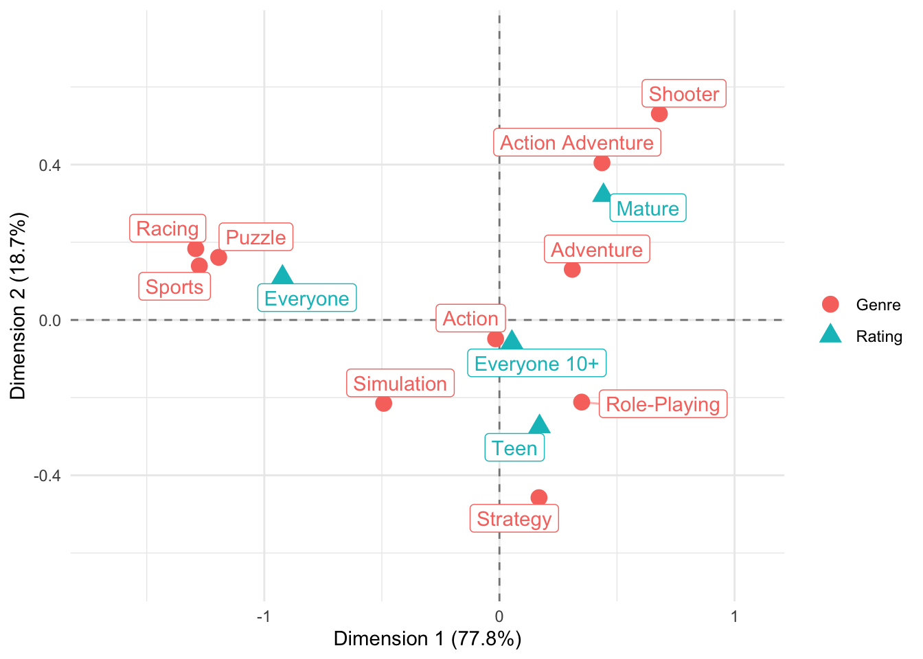
This seems to have worked quite fine. It’s not surprising that Sports, Racing, and Puzzle are closely associated with an ‘Everyone’ rating. What I find a little surprising is that the genre Action is so close to the middle of the graph and not closer to a ‘Mature’ rating. If we look at the contingency table again, this makes a little more sense: Action is by far the most assigned genre. It seems as if more ‘intense’ or ‘gory’ action titles are assigned to other genres (e.g., the quite fittingly placed Shooter genre which is clearly in the ‘Mature’ part of the graph). Even ‘Action Adventure’ is much closer to a ‘Mature’ rating than ‘Action’…
Bye
Well, that’s it for our little tour around the video games ratings dataset. Feel free to let me know what you would be interested in or to point me to your analyses on the same dataset. For now, I am having a break with some good old Nine Inch Nails music…
