'After years of waiting, nothing came': My last.fm charts of 2023
You know what I hate? Annual reviews that are published even before December (looking at you, Spotify Wrapped)! What’s the point of summing up the year with (sometimes less than) approx. 90% of the data? So, with things being what they are, we might have to come up with our own annual reviews. In this case, I want to use my Last.fm listening history for 2023.
I have pre-compiled all the so-called “scrobbles” (plays of one track) via Last.fm’s API. Please contact me (e.g. via my Mastodon profile) if you’re interested in the custom function to download all scrobbles for a given period. I’ll gladly send it to you.
To begin, we’re loading some packages and two datasets holding all the scrobbles for 2022 and 2023: lfm22 and lfm23.
library(lubridate)
library(ggplot2)
library(ggfittext)
library(dplyr)
library(hrbrthemes)
library(ggrepel)
lfm22 <- readRDS("lfm22.Rds")
lfm23 <- readRDS("lfm23.Rds")
Artist charts
First, let’s compile a list of artists with the associated “scrobbles”. I’m doing this for 2023 (dist) and 2022 (dist22). Then, I am merging the two tibbles (which is an enhanced version of R’s dataframes). With this operation, we get the plays in 2023 and 2022 in one datasource. Along the way, I am also assigning the rank of each artist in both of the years (column rank).
dist <- lfm23 %>%
  group_by(artist) %>%
  summarise(plays = n()) %>%
  arrange(desc(plays)) %>%
  mutate(
    rank = 1:n(),
    artist = forcats::fct_reorder(artist, plays)
  )
dist22 <- lfm22 %>%
  group_by(artist) %>%
  summarise(plays = n()) %>%
  arrange(desc(plays)) %>%
  mutate(
    rank = 1:n(),
    artist = forcats::fct_reorder(artist, plays)
  )
dist <- merge(dist, dist22, by = "artist", all.x = T)
dist <- dist[order(dist$plays.x, decreasing = T), ]
Now, I am calculating the rank difference between the two years and am pasting in upward- and downward-pointing triangles to visualize the direction between 2023 and 2022. If it is a new artist, we get a new, if the rank stays the same, we get a —.
dist <- dist %>% mutate(rank.diff = rank.x - rank.y)
dist$rank.lab <- ifelse(dist$rank.diff < 0,
                        paste0("▲", abs(dist$rank.diff)),
                        ifelse(dist$rank.diff > 0,
                               paste0("▼", abs(dist$rank.diff)), "—"))
dist[is.na(dist$rank.lab), "rank.lab"] <- "new"
Now for plotting my top 20 artists of 2023. Look at the call to geom_bar_text() from the wonderful {ggfittext} package: here, I am inserting the rank.lab to have the rank difference to 2022 displayed in each of the bars.
ggplot(dist[1:20, ], aes(x = plays.x, y = artist, fill = plays.x)) +
  geom_col() +
  geom_bar_text(aes(label = rank.lab)) +
  scale_fill_binned(guide = "none") +
  labs(x = "Plays", y = "", title = "Artist charts for 2023") +
  theme_ipsum_rc()
You can see that the Cold War Kids claimed the number 1 spot after being number 3 in 2022. OK Go came in second and is completely new to my charts. I also listened a lot more to The Yeah Yeah Yeahs because I really liked their new album “Cool It Down”. Speaking of albums, let’s do the same for albums:
dist.alb <- lfm23 %>%
  mutate(art.alb = paste0(artist, ": ", album)) %>%
  group_by(art.alb) %>%
  summarise(plays = n()) %>%
  arrange(desc(plays)) %>%
  mutate(
    rank = 1:n(),
    art.alb = forcats::fct_reorder(art.alb, plays)
  )
dist22.alb <- lfm22 %>%
  mutate(art.alb = paste0(artist, ": ", album)) %>%
  group_by(art.alb) %>%
  summarise(plays = n()) %>%
  arrange(desc(plays)) %>%
  mutate(
    rank = 1:n(),
    art.alb = forcats::fct_reorder(art.alb, plays)
  )
dist.alb <- merge(dist.alb, dist22.alb, by = "art.alb", all.x = T)
dist.alb <- dist.alb[order(dist.alb$plays.x, decreasing = T), ]
dist.alb <- dist.alb %>% mutate(rank.diff = rank.x - rank.y)
dist.alb$rank.lab <- ifelse(dist.alb$rank.diff < 0,
                            paste0("▲", abs(dist.alb$rank.diff)),
                            ifelse(dist.alb$rank.diff > 0,
                                   paste0("▼", abs(dist.alb$rank.diff)), "—")
)
dist.alb[is.na(dist.alb$rank.lab), "rank.lab"] <- "new"

ggplot(dist.alb[1:20, ], aes(x = plays.x, y = art.alb, fill = plays.x)) +
  geom_col() +
  geom_bar_text(aes(label = rank.lab)) +
  scale_fill_binned(guide = "none") +
  labs(x = "Plays", y = "", title = "Album charts for 2023") +
  theme_ipsum_rc()
See? There’s “Cool It Down” right on the second spot.
Distribution over day, week, and year
Radial plots are often used to visualize cyclical data, like the time of day, weekdays or months. But first, some simple manipulation and summary stuff:
* extract the hour of the timestamp
* factorize the hour because we want to keep hours with zero plays later on
* group by hour (note the .drop = F to keep hours with zero plays) and see how many plays there are in each hour
* merge 2022 and 2023 and convert it to long format with pivot_longer()
* convert hour back to a number to get the proper sorting
lfm23$hour <- hour(lfm23$timestamp_cl)
lfm23$hour <- factor(lfm23$hour, levels = 0:23)
lfm22$hour <- hour(lfm22$timestamp_cl)
lfm22$hour <- factor(lfm22$hour, levels = 0:23)

lfm23.hr <- lfm23 %>%
  group_by(hour, .drop = F) %>%
  summarise(plays23 = n())
lfm22.hr <- lfm22 %>%
  group_by(hour, .drop = F) %>%
  summarise(plays22 = n())
lfm23.hr <- merge(lfm23.hr, lfm22.hr, by = "hour", all.x = T)
lfm23.hr <- tidyr::pivot_longer(lfm23.hr, plays23:plays22)
lfm23.hr$hour <- as.numeric(as.character(lfm23.hr$hour))
With {ggplot2} it’s as easy as adding a coord_polar() to your plot to create a radial plot. This works with geom_line() which I am using for the hour plot (which is the same as the distribution of plays of the day).
ggplot(lfm23.hr, aes(x = hour, y = value, col = name)) +
  geom_line(lwd = 2, alpha = .7) +
  scale_y_continuous(breaks = NULL) +
  scale_x_continuous(breaks = 0:23, minor_breaks = NULL) +
  scale_color_manual(
    values = c("plays23" = "blue", "plays22" = "grey"),
    labels = c("plays23" = "2023", "plays22" = "2022")
  ) +
  labs(x = "", y = "", col = "", title = "Plays over the day") +
  coord_polar() +
  theme_ipsum_rc()
And coord_polar() also works with columns. Please also note that I am using normalized plays in this plot (n_plays2022/23), i.e. all the bars sum up to 1 (or 100%) for each year. If you want to compare two years with very different numbers of overall plays, this might be better.
wd <- lfm23 %>% mutate(wday = wday(timestamp_cl,
                                   label = T,
                                   week_start = "Monday")) %>%
  group_by(wday) %>%
  summarize(plays2023 = n()) %>%
  mutate(n_plays23 = plays2023/sum(plays2023))
wd22 <- lfm22 %>% mutate(wday = wday(timestamp_cl,
                                     label = T,
                                     week_start = "Monday")) %>%
  group_by(wday) %>%
  summarize(plays2022 = n()) %>%
  mutate(n_plays22 = plays2022/sum(plays2022))
wd <- merge(wd, wd22)

wd_lf <- tidyr::pivot_longer(wd, plays2023:n_plays22)
wd_lf <- wd_lf[wd_lf$name %in% c("n_plays23", "n_plays22"),]

ggplot(wd_lf, aes(x = wday, y = value, fill = name)) +
  geom_col(position = "dodge") +
  scale_fill_manual(
    values = c("n_plays23" = "blue", "n_plays22" = "lightblue"),
    labels = c("n_plays23" = "2023", "n_plays22" = "2022")
  ) +
  labs(x = "", y = "", fill = "", title = "Plays over the week") +
  coord_polar() +
  theme_ipsum_rc() + theme(axis.text.y = element_blank())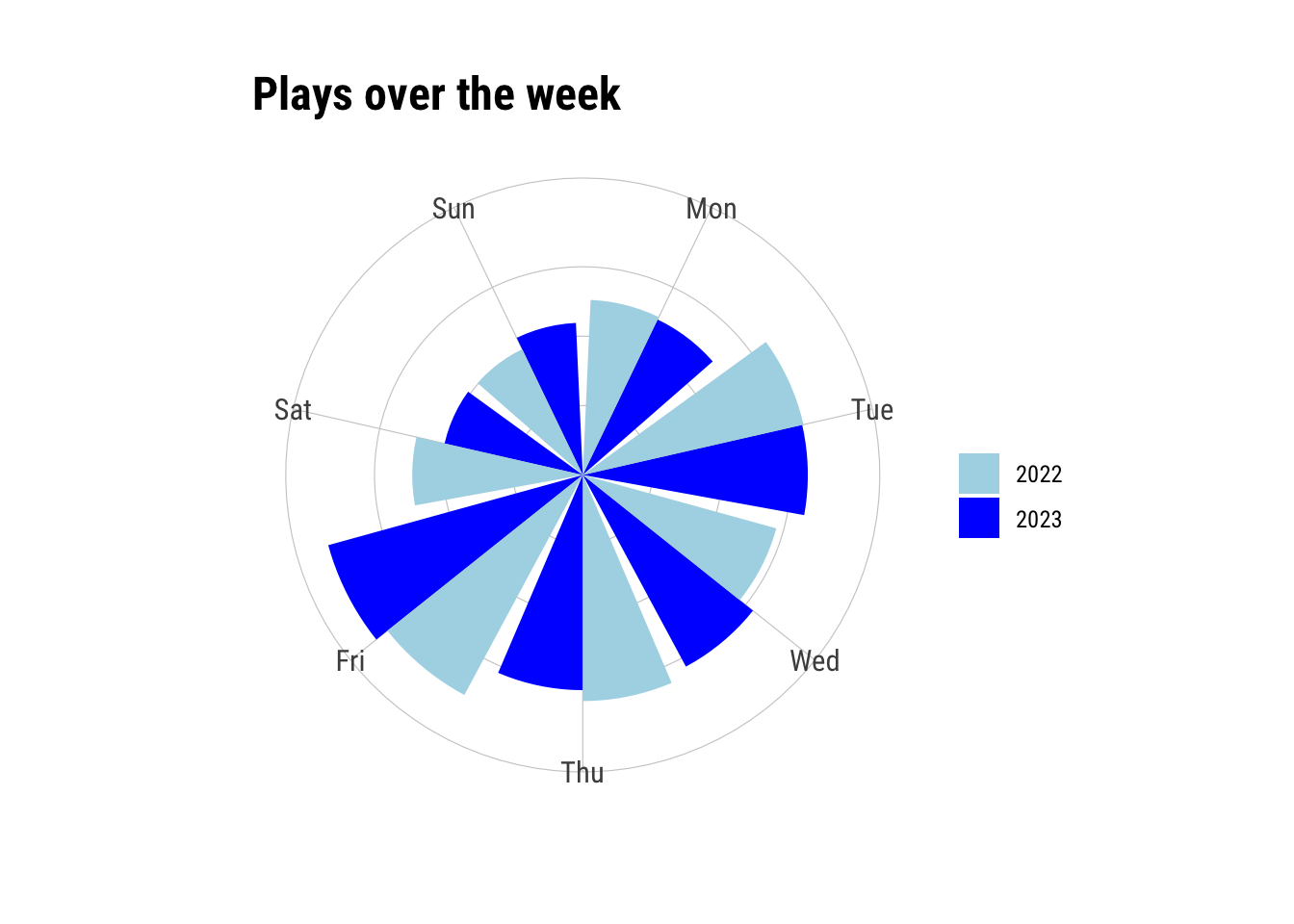
Finally, let’s do the same for months.
lfm23$month <- month(lfm23$timestamp_cl)
lfm22$month <- month(lfm22$timestamp_cl)

lfm23.mn <- lfm23 %>%
  group_by(month, .drop = F) %>%
  summarise(plays23 = n()) %>%
  mutate(n_plays23 = plays23/sum(plays23))
lfm22.mn <- lfm22 %>%
  group_by(month, .drop = F) %>%
  summarise(plays22 = n()) %>%
  mutate(n_plays22 = plays22/sum(plays22))
lfm23.mn <- merge(lfm23.mn, lfm22.mn, by = "month", all.x = T)
lfm23.mn <- tidyr::pivot_longer(lfm23.mn, plays23:n_plays22)
lfm23.mn <- lfm23.mn[lfm23.mn$name %in% c("n_plays22", "n_plays23"),]

ggplot(lfm23.mn, aes(x = month, y = value, fill = name)) +
  geom_col(position = "dodge") +
  scale_y_continuous(breaks = NULL) +
  scale_x_continuous(breaks = 1:12, minor_breaks = NULL) +
  scale_fill_manual(
    values = c("n_plays23" = "blue", "n_plays22" = "lightblue"),
    labels = c("n_plays23" = "2023", "n_plays22" = "2022")
  ) +
  labs(x = "", y = "", fill = "", title = "Plays in months") +
  coord_polar() +
  theme_ipsum_rc()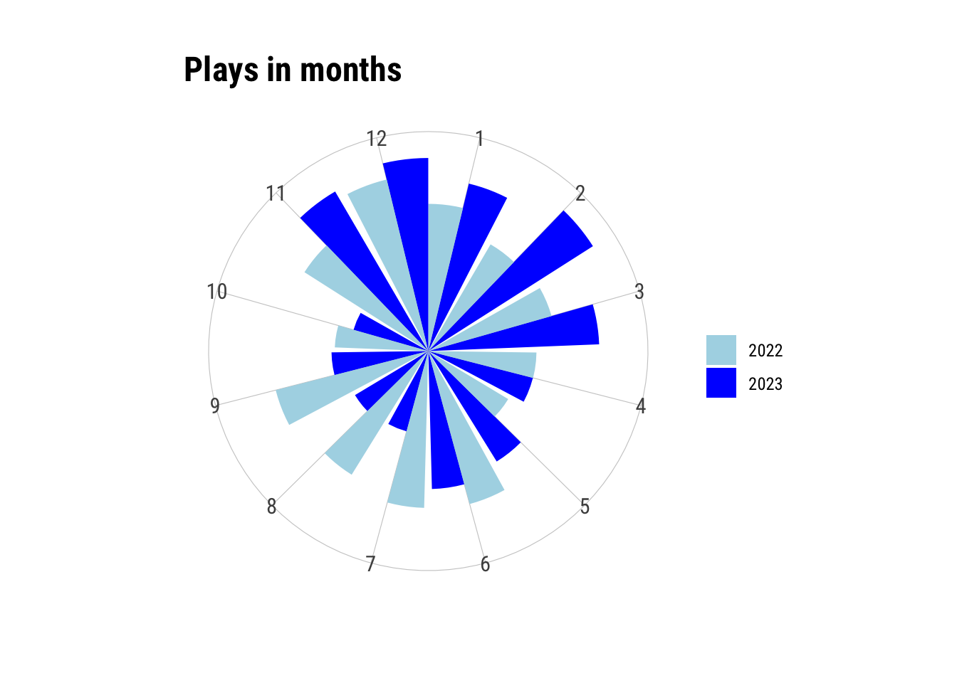
Again, these are normalized plays. There’s a pretty obvious contrast between the beginning of the year and the summer months. Let’s look at this again using a simple (non-radial) line plot.
ggplot(lfm23.mn, aes(x = month, y = value, col = name)) +
  geom_line(lwd = 1.5) +
  scale_y_continuous(labels = scales::percent) +
  scale_x_continuous(breaks = 1:12, minor_breaks = NULL) +
  scale_color_manual(
    values = c("n_plays23" = "blue", "n_plays22" = "lightblue"),
    labels = c("n_plays23" = "2023", "n_plays22" = "2022")
  ) +
  labs(x = "", y = "% plays of whole year", col = "", title = "Plays in months") +
  theme_ipsum_rc()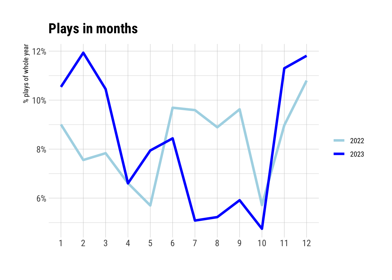
Repetitive listening behavior
To be honest, I couldn’t come up with a better section title for this. What I want to know is: how often did I listen to the same songs/albums for all of my top 20 artists in 2023? A pretty simple metric to analyze this is the number of different titles/albums divided by the number of total plays. This metric could also be described as “On average, how many new titles/albums are encountered with each play?”. Let’s calculate these metrics and call them titles/albums_per_plays. If this metric is 1 for albums, each play would be from a different album. If it is 1 for titles, each play is a different title.
art.info <- lfm23 %>% group_by(artist) %>%
  summarize(n_titles = length(unique(title)),
            n_albums = length(unique(album)),
            n_plays = n()) %>%
  mutate(titles_per_plays = n_titles/n_plays,
         albums_per_plays = n_albums/n_plays) %>%
  arrange(-n_plays)

ggplot(art.info[1:20,], aes(x = n_plays, y = albums_per_plays)) +
  geom_point() +
  geom_text_repel(aes(label = artist), family = "Roboto Condensed",
                  min.segment.length = 0) +
  labs(x = "Number of plays", y = "Number of different albums per play") +
  theme_ipsum_rc()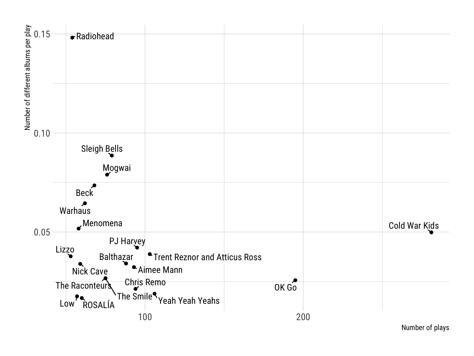
The figure above shows the metric for albums and relates it to the number of overall plays. For example, if we contrast Radiohead and Cold War Kids, we see that Radiohead got fewer overall plays in 2023 but it was much more probable to “encounter” a different album with each play. The upper-right quadrant of the plot is rather empty. That means that there are no artists in my top 20 with many overall plays and a lot of different albums. Let’s do the same with track titles.
ggplot(art.info[1:20,], aes(x = n_plays, y = titles_per_plays)) +
  geom_point() +
  geom_text_repel(aes(label = artist), family = "Roboto Condensed",
                  min.segment.length = 0) +
  labs(x = "Number of plays", y = "Number of different tracks per play") +
  theme_ipsum_rc()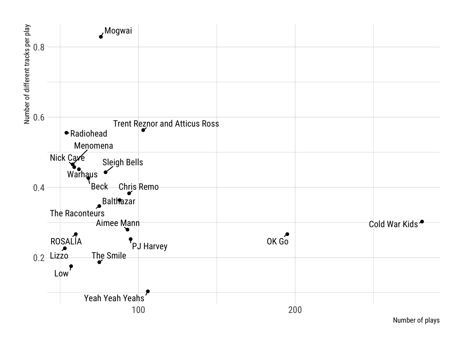
We get the same pattern for OK Go and Cold War Kids, but the most “diverse” listening behavior can be shown for Mogwai. The metric is slightly over 0.8, so almost every play for this artist has been a new song title.
So, that’s it for today. Please let me know if you have any questions or more ideas how to analyze this dataset.